Understanding the Box Model in CSS

Introduction
When you’re starting off with learning HTML and CSS, things can get overwhelming pretty quickly. At least they did for me.
You find that there’s a plethora of HTML elements and CSS properties and values, and you start thinking that you need to start memorizing them all. Or how else would you learn to build web pages, right?
Wrong.
Thanks to google, you can look up things when you need them. Details like how to disable the resizing of a textarea element, or change the type of cursor on an element.
But that does not apply across the board.
There are some important concepts that you must understand very well in order to build a solid foundation to ease your progression and growth in web development.
It is the understanding of these concepts that you should focus on doing. The cascading behavior of CSS, specificity, what browsers are, client/server architecture, all fall into this category.
One of CSS foundational pillars is the box model. It is how every element renders in your browser.
What’s the box model?
It’s a CSS standard that represents the elements of a document as boxes with certain properties (sizing, positioning, stack of elements…) based on CSS styles.
Put simply, every HTML element is a box of this sort:
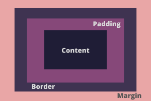
Every box has a content area. An element’s content could be text, an image, nested elements etc.
In addition to the content area, an element may also have (as shown above):
-
Padding area: space between the content and the border. The size of this area is defined by padding properties:
padding-top,padding-right,padding-bottomandpadding-left. Or simply thepaddingshorthand. -
Border are: space between the padding and the margin. The size of this area is defined by the
border-widthproperties (same drill as the padding: top, right, bottom and left). -
Margin area: space between an element and its neighbors. The size of this area is defined by the
marginproperties, negative values can be provided for margins.
Quick explanation of shorthands (feel free to skip if you are familiar with them):
Shorthand properties are CSS properties that combine other properties. We use them to write less code and easily read it.
We’ll use padding as an example, the same idea applies for other shorthands as well.
The shorthand property padding can take:
- One value:
padding: 1rem.
This is the same as writing:
padding-right: 1rem;
padding-top: 1rem;
padding-bottom: 1rem;
padding-left: 1rem;- Two values:
padding: 1rem 2rem.
Which is equivalent to:
padding-top: 1rem;
padding-bottom: 1rem;
padding-right: 2rem;
padding-left: 2rem;- Four values:
padding: 1rem 2rem 3rem 4rem.
That element is going to look weird as hell but just ignore it, it’s for the sake of example :3
It’s the same as:
padding-top: 1rem;
padding-right: 2rem;
padding-bottom: 3rem;
padding-left: 4rem;
A rule of thumb to remember this last part is to picture the motion of a clock: it goes from the top, to the right, to the bottom and then to the left.
Types of boxes
Now that we’ve had an overview of how elements are represented as boxes. We’ll now discover how different types of boxes have different behaviors.
The different types of boxes are based on the display values: block, inline and inline-block.
I highly suggest you mess around with this for a bit to get the hang of it.
Block type box
Elements that fall into this type are those that have display property set to block, either by default (like div) or manually (adding display: block to the element with CSS).
-
Starts on a new line.
-
height,width,margin,paddingare all applied and work as expected. -
The element’s width will fill its parent container unless otherwise specified.
Inline type box
Elements that fall into this type are those that have display property set to inline, either by default (like span) or manually (adding display: inline to the element with CSS).
-
If there’s remaining space, it gets placed next to the previous element. Otherwise, it starts on a new line.
-
heightandwidthproperties have no effect on the element. -
Horizontal
marginandpaddingare applied and work as expected. -
Vertical
marginandpaddingare a bit tricky here, so bear with me. Both of the vertical properties are applied (you can check this using your developer tools), but they do not work as expected:margindoes not have any effect. No spacing takes place between the inline element and adjacent elements.paddinghas an effect. You can test this out by adding a background color, it does not affect adjacent elements though. The padding does not push the other elements.
It is very important to experiment with the above, this kind of details cannot be understood through reading only. Create block and inline elements and play around with their
width,height,marginandpadding.
Inline-block type box
Yep, you read this right. This box right here is the offspring of the last two types.
Elements that fall into this type are those that have display property set to inline-block, either by default (like button) or manually (adding display: inline-block to the element with CSS).
-
Behaves like inline: sits next to previous element if there’s remaining space, or starts on a new line otherwise.
-
width,height,marginandpaddingbehave as expected.
Box sizing
box-sizing is a CSS property that defines how the properties height, width, border and padding work together.
It has 2 values (or modes):
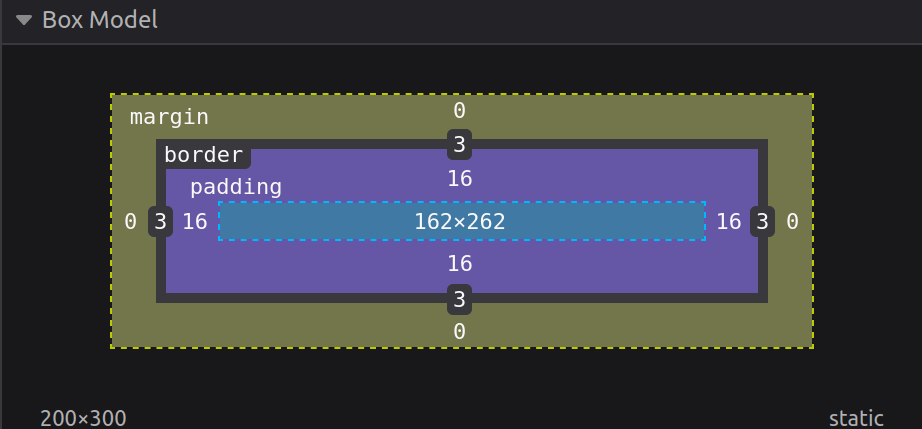
We’ll have this code examined in both modes:
<div>Banana man</div>div {
height: 300px;
width: 200px;
border: 3px solid red;
padding: 1rem;
}content-box (the default)
The rendered dimensions would not be equal to the height and width specified in your CSS.
But rather (for the width) width + padding-left + padding-right + border-left-width + border-right-width.
Visual representation from my developer tools (I use Firefox, this is from Firefox. Use Firefox):

You can see that what height and width did is specify the content area dimensions, but not the overall element size.
border-box
The rendered dimensions are exactly the values of height and width specified in your CSS.
To enable this mode, we’ll add box-sizing: border-box to our div. We get this:
As you can see, the dimensions of the content area would be computed so that the overall size of our element matches 200px width and 300px height.
This mode is often the most used and is included in CSS resets. This way, it is easy to match your website design pixel-perfectly, letting the browser enjoy computing the difference.
Bonus tip (debugging CSS)
Since everything in a website is a rectangular box, it would be easy to help ourselves visualize that in our websites.
Whenever I encounter a bug, or a behavior I do not understand in my website (layout, positioning etc), I add border: 1px solid red to all the elements I am skeptical about.
I would change the color to differentiate between them though. You get the point.
That way, you get a better picture of the layout of your website, how everything is positioned, the margins, the paddings etc. Without having to check every element individually using developer tools.
Conclusion
TLDR; every website is a bunch of rectangular boxes nested inside other rectangular boxes. Boxes everywhere.
So that was the box model for you. One of the key concepts of CSS. One topic down (hopefully :3), many to go!
Thank you for reading!
That was it. I hope you learned something new and enjoyed reading!
Have a nice one.